

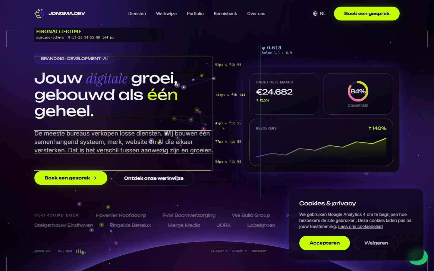
What is the Fibonacci spacing system?
Instead of picking margins and gaps by feel (12px here, 15px there, 40px further along), you fix one scale that every distance comes from. We use the Fibonacci sequence: 8, 13, 21, 34, 55, 89 and 144 pixels. Each value is the sum of the two before it, and the ratio between consecutive values approaches the golden ratio (1:1.618), the same proportion found in leaf veins, shells and classical architecture.
That sequence is defined once in code as design tokens and reused everywhere. A title sits 34px from its heading, a section breathes 89px, two columns split on the golden ratio. So each distance is not a separate choice but a rung on a fixed ladder.
Why proportion affects trust and findability
Visitors rarely name it, but they feel it: a page with a consistent rhythm looks polished and trustworthy, while arbitrary spacing reads as restless and amateurish. For a service business that first impression is conversion, trust translates directly into enquiries.
There is a technical gain too. One spacing scale means fewer design decisions, faster development and a more predictable layout, which helps prevent shifting content (a Core Web Vitals signal). And for AI answer engines, demonstrable craft counts as an authority signal: a site that systematically justifies its own design radiates expertise.
How we apply it, and how we verify it
On jongma.dev every distance comes from the Fibonacci tokens and the hero section splits text and data visual on the golden ratio. It is not decoration added afterwards but the foundation under the layout, exactly as our method builds the temple: foundation first, then structure.
To prove it holds up, we lay a thin-line proportion overlay over the real page: horizontal lines mark the vertical rhythm, a vertical line the golden-ratio column split, and every measured distance lands on the nearest value in the sequence. Design you can measure instead of only look at.
· Maricio Jongma, Jongma Development